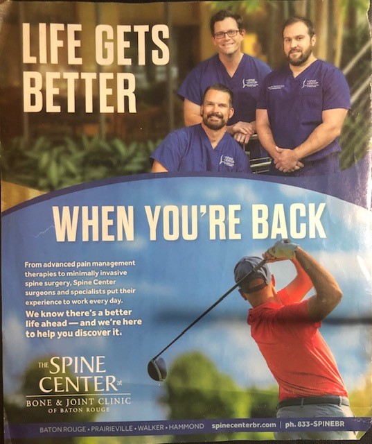
On this ad redo, the first thing I thought to change was the context of the above image to make it align more with the message of the text. Instead of a picture of the three main doctors, the picture I used shows a storyline from doctors visit to the below image of being able to play golf again. I also eliminated much of the wordy text used on the bottom left in favor of a summary of the three most important things the text mentions. Unfortunately, the only clear image I could find of the office’s logo has a dark blue background that doesn’t really match the tone of the stock images but it does make the logo of the company stick out in a sense.

Leave a comment