-
Bad Website Fix
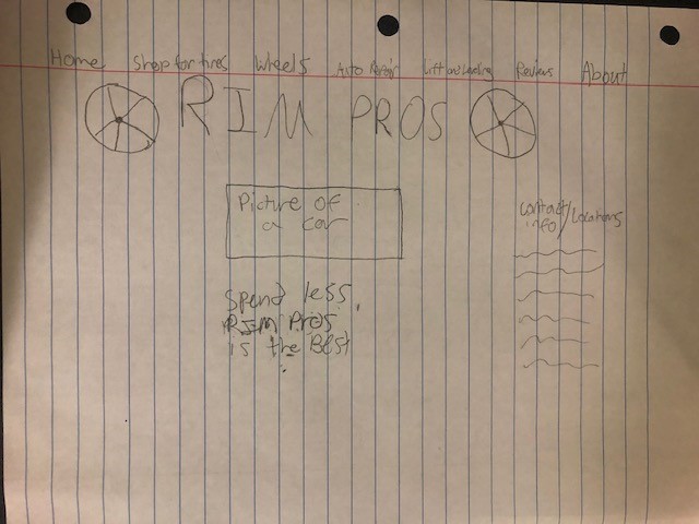
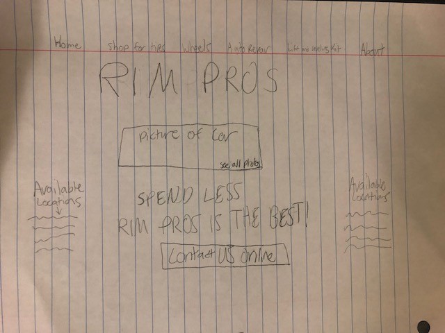
For the Rim Pros website most of what I fixed was just organizational. In the original website design there was a significant amount of blank space which forced you to scroll down further than necessary to see repeated information and links. I also moved the tagline directly under the business title versus under the pictures of cars.
-
Bad websites
-
Travel Brochure
-
Promo ad
For this ad I tried to emphasize the tagline and the name of the design. I used several different stock photos in order to create a device that would somewhat resemble the product in reality. The stock photos of the people were not cohesive with the product design I had in my head so I was hesitant to emphasize the before and after of using the product even though I feel that it is important.
-
Photoshop Collage
This collage is my version of plants versus zombies. These two zombies are currently out in an overgrown garden attempting to cut plants and grass. The zombie on the left has the hedge trimmers and the zombie on the right has a push lawnmower in his hands. The zombie on the left was also given a mustache and a hat to make the difference between the two suited zombies stand out more.
-
Bad-ad redo
On this ad redo, the first thing I thought to change was the context of the above image to make it align more with the message of the text. Instead of a picture of the three main doctors, the picture I used shows a storyline from doctors visit to the below image of being able to play golf again. I also eliminated much of the wordy text used on the bottom left in favor of a summary of the three most important things the text mentions. Unfortunately, the only clear image I could find of the office’s logo has a dark blue background that doesn’t really match the tone of the stock images but it does make the logo of the company stick out in a sense.

original-ad -
Color Assignment
For this assignment I used the color green as the main focus. At first the adjective I was using to create the ad was “wild” instead of “natural.” I made this change because I believe that “natural” is a much more accurate description of the color green. Nature in itself is supposed to be a calming force and the stock photo used stuck out as the most serene image available to depict a natural environment.
-
News Article
-
Business Card II
While I chose to keep the business card a simple black and white, I made improvements to margin spacing and alignment. I also improved the contrast between font sizes to better emphasize certain parts of the card, like my name as a focal point. I also moved the tiger silhouette from the bottom right corner to closer towards the middle to maintain the balance and focus of the card as a whole.
-
Business Card
The hardest part about creating the business card was figuring out how artistic or simple the business card should be. I felt like my business card was relatively plain but I wasn’t completely sure what else to add. I wanted to keep it professional so I held back from using various colors. I divided the page using the line tool to break up some of the information and limit some white space. The tiger silhouette was added as a logo placeholder to add character to the business card.
-
Subscribe
Subscribed
Already have a WordPress.com account? Log in now.
